This guide will walk you through the process to set up a Hugo website using the Blowfish theme. This is what I’m using for my new website right now and it looks and runs great! I’m going to use the recommended steps for getting this installed and then I’ll also cover some of the finer details to get it configured.
There’s a new installation process that can be used, though it’s still in beta for the time being. I’ll stick with the older process until the new one is out of testing. Feel free to use it if you want though. You can find it on their website here. Also, you’ll need to use the documentation there for quite a bit of this process. This guide is meant to cover some things that I figured out through my own testing.
To install the Blowfish theme, you’ll need to grab a few things to get started. Install Git, Go, and then the extended edition of Hugo. Each of those has installation instructions on their sites, so I won’t cover those here.
You’ll also need to use an editor. I personally prefer Visual Studio Code, but feel free to choose whatever you want to. Also, if you decide you want to host your site and upload it through GitHub, using the GitHub Desktop app is extremely convenient. If you haven’t used it before, you can push changes to your repo as soon as you’re ready with the desktop app.
The one other thing you’ll want to do ahead of time is figure out where you actually want to have the site hosted. You have plenty of options to choose from such as GitHub Pages, Cloudflare Pages, Netlify, and so on. They all have some slight differences, so whatever you want to use, just research what you think will best suit your needs.
Once you’ve got all the prerequisites installed, here’s a quick way to get up and going. Go to wherever you want to website folder to be on your computer, i.e. D:/WebsiteProject. Once you have a location picked out, right click in file explorer and select the option to open a terminal.
Run the following command:
hugo new site newwebsite <– This is the folder name for your website. Change it to whatever you want it to be.
Once the directory is created, let’s install the Blowfish theme using these commands:
cd newwebsite <-- Replace this text with whatever you made the folder name.

git init

git submodule add -b main https://github.com/nunocoracao/blowfish.git themes/blowfish
Now Blowfish is installed. Next, type this command into the terminal:
code . <– This is assuming you’re using VS Code since that command will bring it up as the editor.
In order for the website to work, there’s a couple things that needs to be done if you installed this the way I’ve covered here. First, from the root of your website folder, make a new folder called config. Inside of the config folder, make another one called _default.
Then from there, go to themes>blowfish>config>default> and copy and paste all six of the .toml files from there into the new default folder you made. Open up the config.toml file in the new default folder you made. Look for this line which will be near the top:
# theme = "blowfish"
Remove the pound sign and save it. Now go back to the terminal window you have open and type in:
hugo server
This will allow you to see a local preview of the website by typing http://localhost:1313/ into your browser search bar.
You should now see a mostly blank webpage.
Where you decide to go with much of the actual design is going to be up to you with your preferences. There’s quite a bit of customization that can be done in the config files to change things. You can follow along with the devs documentation for all the different options. I’ll guide you along some of the different choices I made for my site.
If you wanted to follow a similar homepage design like how mine is, you’ll need to make some changes to params.toml. First, you’ll need to uncomment (remove the #) for the background image near the top. Then in the [homepage] section, change the layout to background and uncomment the homepageImage option.
To test this out, go to themes>blowfish>exampleSite>assets>img and copy the ocean.jpg file out of there. Then paste it into the assets folder for your root website folder. You’ll also need to change the background image file name in params.toml to ocean.jpg.
Then go to the content folder and make a file called _index.md. This will be for the homepage of your website. Just type some text in there for now.
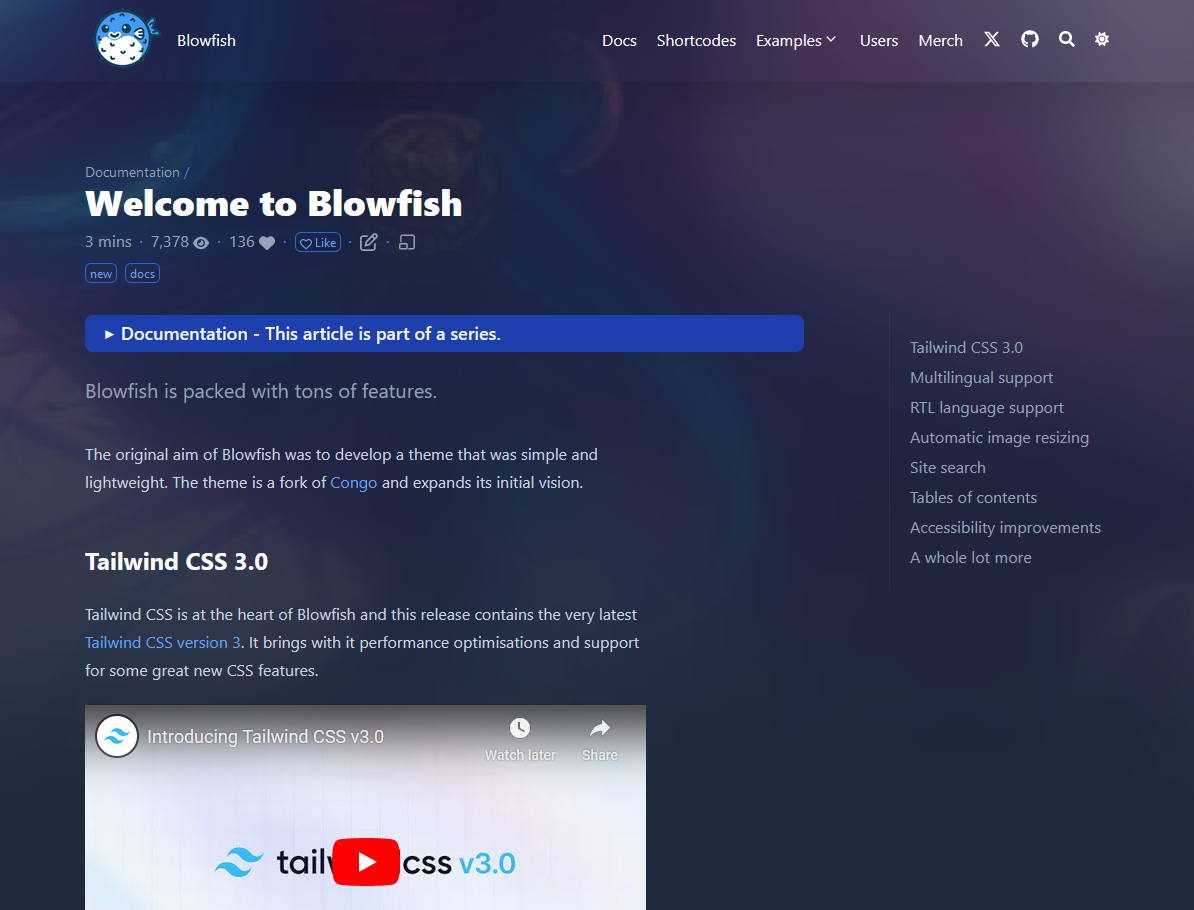
Save the changes and your site should now look like this:
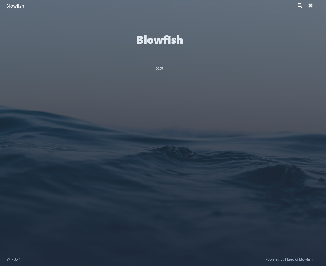
Things are starting to take shape.
Let’s add a menu item to click on. Go to menus.en.toml and take the first [[main]] option. Uncomment the sections and save it to have it show up in the header’s navbar. By default, it’s going to try to navigate to “posts.”
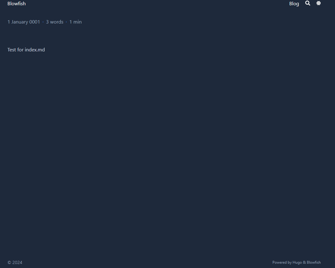
Then make a new folder inside the content folder and call it posts. Then create an _index.md file and enter some text. Now you when you save and click on the menu option, you should see this:
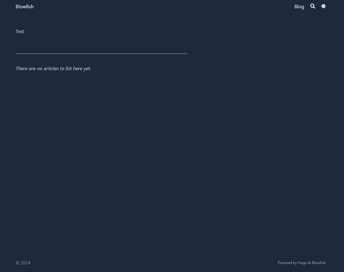
Now you can see the general idea of how this works. In the menu toml file, whatever the “pageRef” is, i.e. Blog, the folder you make inside the content folder needs to have the exact same name. If you ever want to change the names for your folders around, just remember you have to go back to the menu toml file and make the changes for the navbar.
Here’s something else that’s really important. You’ll need to plan ahead how you want people to navigate around through the blog posts, articles, guides, etc. If you name a file _index.md, it gives the option to place articles inside of that folder structure to click on. This is called a list page. Here’s what that looks like:
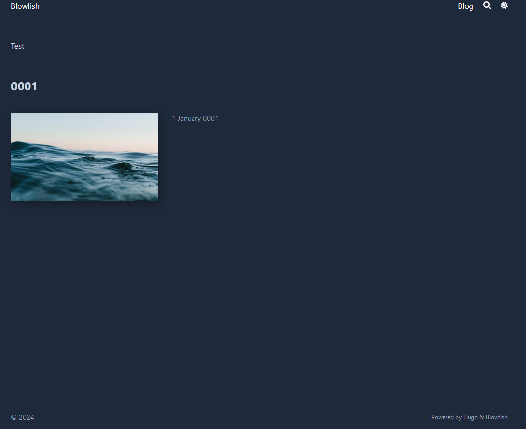
Then you can make another folder inside the page folder to post an article. You can name the file index.md, which doesn’t have the option to click into a different article. This is called a leaf page. Here’s what I mean:
Here’s how that looks in your editor:
content>posts>_index.md
content>posts>blog1>index.md
blog1 is the name of the folder I made inside posts and index.md is the file name needed to be able to put content on that blog1 page. If you wanted a series of blog articles inside the posts section, here’s what that would look like:
content>posts>_index.md
content>posts>blog1>index.md
content>posts>blog2>index.md
content>posts>blog3>index.md
content>posts>blog4>index.md
All four of the blog articles can be clicked on from inside the posts page. If this doesn’t make sense, have a look in the video for a further explanation where I show it in practice.
So now you’ve got the basics down. You know how to add menu items, how to make blog articles and have a main section that links to those articles, and you know how to change out the background image for the website.
Much of the work from here is a process of you figuring out how you specifically want your website to look. There’s a few other miscellaneous things that I’ll add that is to be used in supplement with the documentation on the dev website.
If you look at the above image, you can see the text is aligned to the left a bit. Now this all comes down to personal preference, but I prefer the body of text to always be centered. I’ve seen plenty of websites use different methods of text display, so you might be okay with the default or you might want to change it a bit so that it’s centered.
Here’s how that looks on my website currently:

You can see the body text and headers are centered in the page. I used a bit of spaghetti CSS code that I threw together. Just FYI, this isn’t 100%. If you use this and you have table of contents enabled on a page, the header is going to be centered, but the text gets placed to the left to make room for the TOC. Otherwise, this seems to work perfectly.
I might come back to this later to write some code for a sticky side menu when a TOC is supposed to be present, except have it show on the right side where it won’t interfere with the center placement of text.
Here’s what I use for the time being:
body * {
  text-align: justify;
  justify-content: center;
}

/* This section for headers allow you to change how they are aligned. If you only want this to change H1 headers for example, then just remove all the other headers from below: */
h1, h2, h3, h4, h5, h6 {
text-align: center;
}

.max-w-prose {
  max-width: 825px;
#  max-width: 100%; /* You can use this in place of the max width pixels option above. Either of them works fine, though I prefer to use the px option. */
  justify-content: center;
  margin-left: auto;
  margin-right: auto;
}
If you want to use this, you’ll need to make a folder named css inside of the assets folder. Then name the file custom.css.
Feel free to workshop the code above to suit your needs. If you want to make changes, just change one thing at a time and save it to see the changes and if it’s something you like.